Problem Statement
Navigating today's real estate apps can be a challenge, due to a complex user experience, information overload, and navigational hurdles. This struggle is especially felt by new buyers who find it difficult to sift through numerous listings efficiently. The lack of clarity in the app interface, combined with the overwhelming volume of information, creates a suboptimal user experience. This limits users' ability to quickly and seamlessly identify listings that match their preferences.
Solution
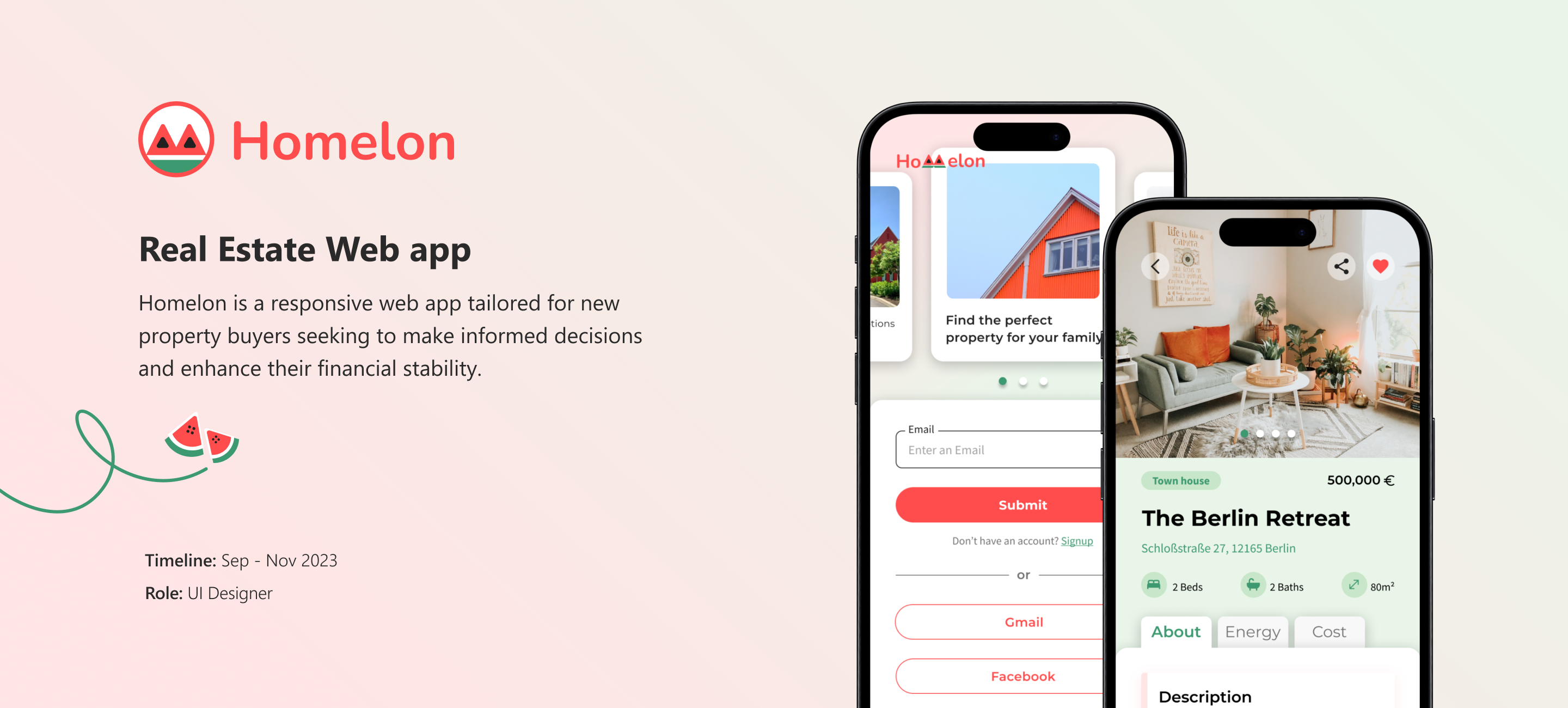
Assisting new property buyers in making informed decisions to enhance their financial stability. My core objective is to tackle the inherent complexities found in traditional real estate apps. I strive to simplify the user experience by refining information presentation and improving overall navigational ease. My emphasis is on delivering a user-friendly interface, carefully crafted to cater to the specific needs of new buyers.
Competitive Analysis
The project brief (user research) had been given, but I observed a gap regarding competitive analysis. To gain a deeper insight into market needs and inform the design of the user flow, I conducted a competitive analysis.I examined three apps—Trulia, ImmoScout, and Zoopla. Through this analysis, I identified the essential functions required for the real estate app.
User Stories
I received various user stories, but I chose to focus on the ones that I deemed more crucial for the real estate app, drawing insights from competitors in the process.


User Flows
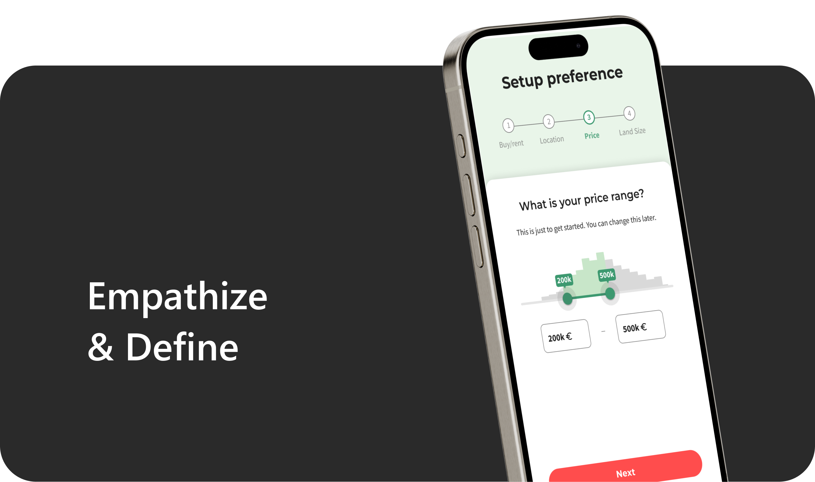
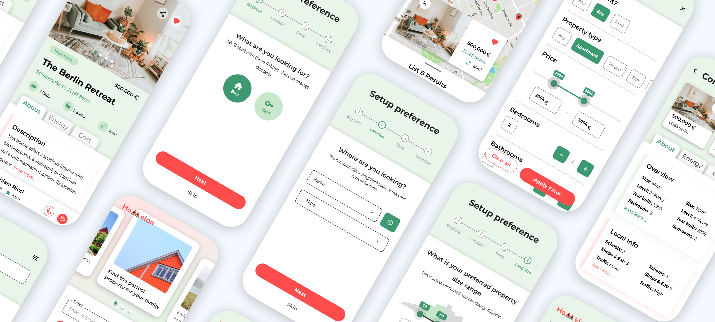
After learning about what users need and studying the competition, the main features for the app became clear. Using this understanding, I created user flows to map out the steps users need to take to reach their goals. To make it easier to spot the key features of the app, I've used a light green color to highlight them.


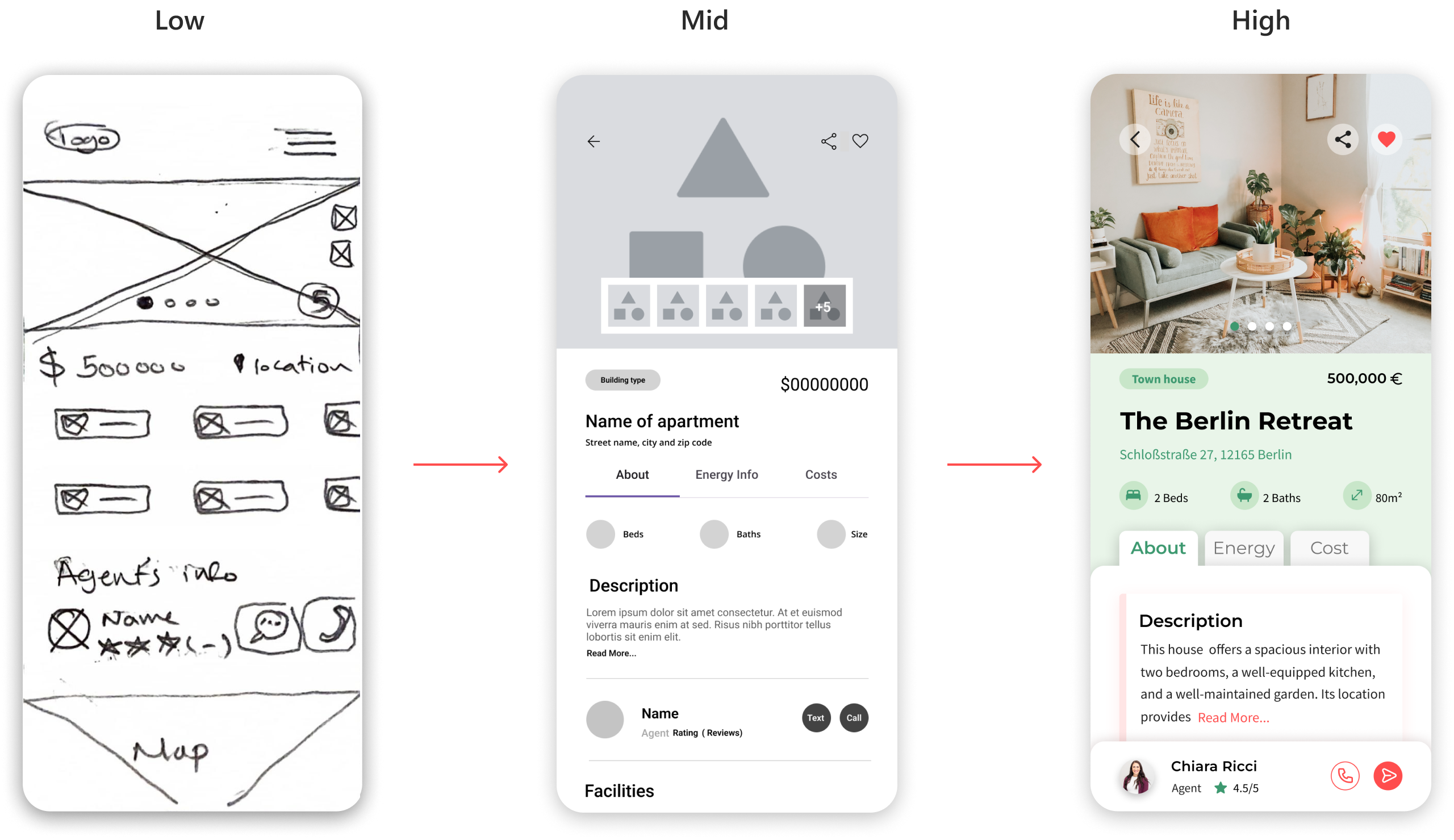
Wireframes
Based on the user flow, I created low-fidelity wireframes to illustrate the fundamental functionality of the app. Then, I progressed to mid-fidelity wireframes to assess the effectiveness of layout, visual hierarchy, and spacing. Following this, I dedicated time to defining the style guide and completing the high-fidelity wireframes.
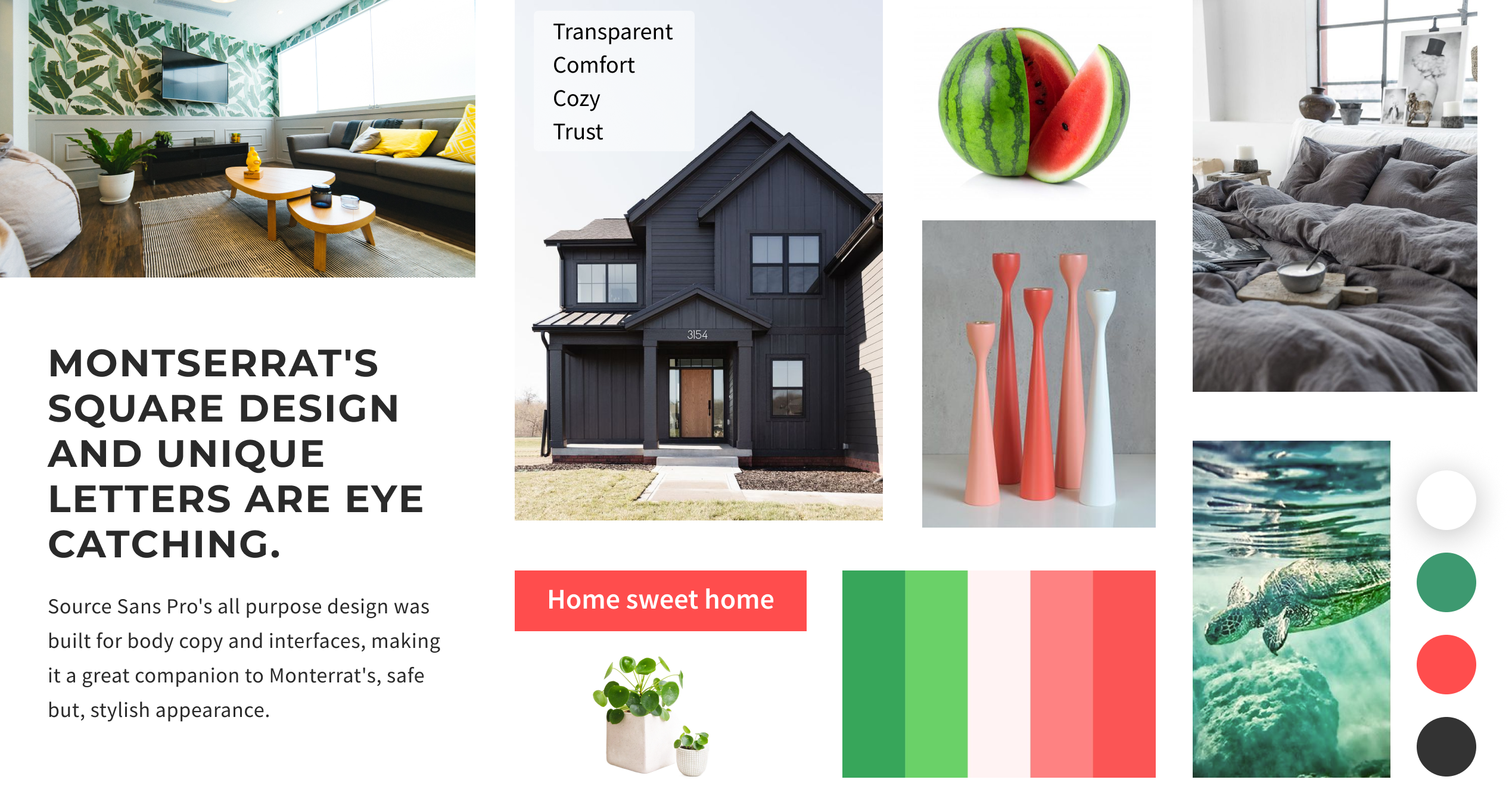
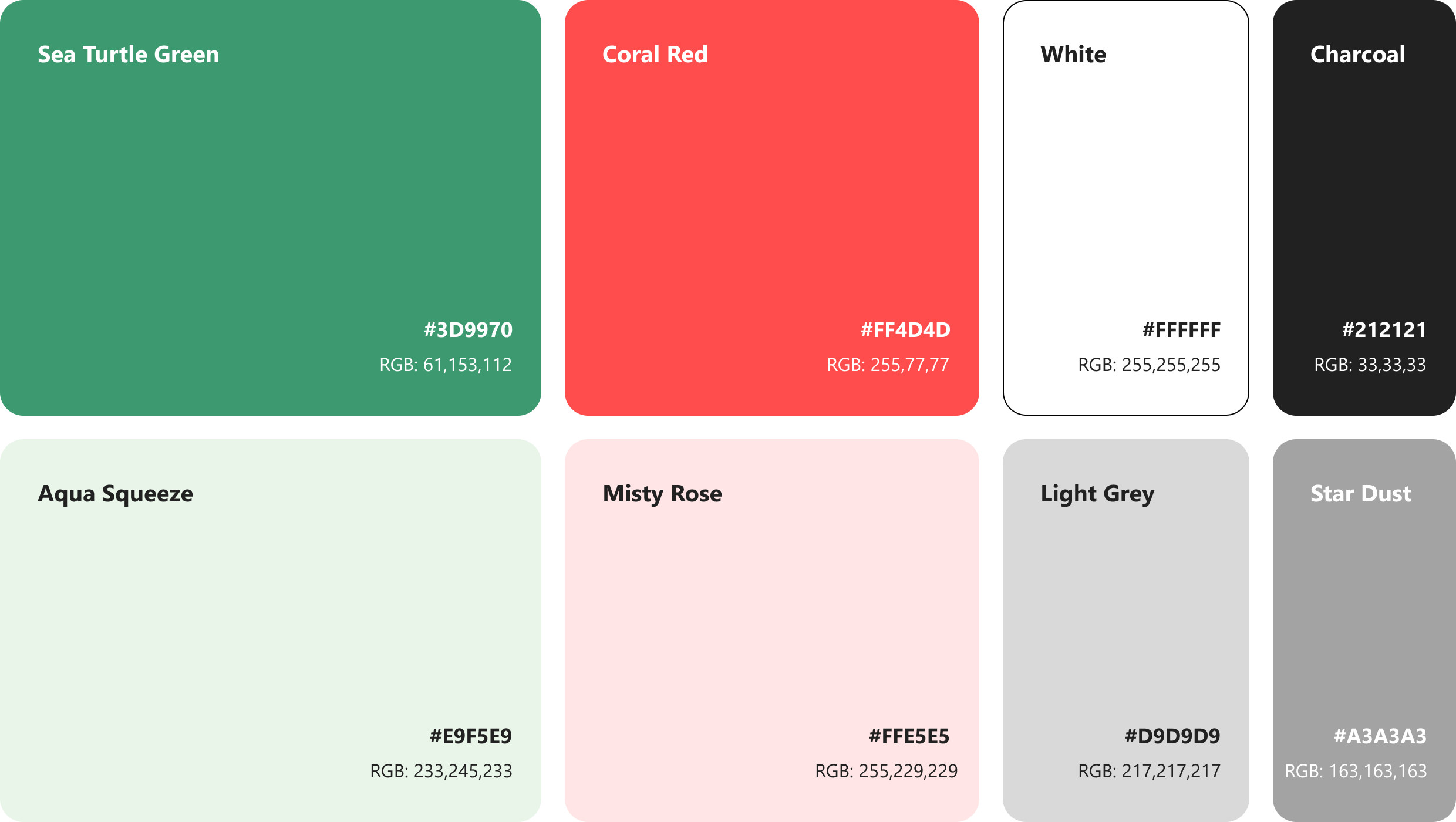
Mood Board
The mood board is inspired by the watermelon color palette. Watermelon Red: These vibrant colors convey energy, ambition, and financial growth, which align with the user's aim for increased financial security for her family. Sea Turtle Green: This color represents nature, growth, and stability, aligning with the user's desire for secure property investments. Charcoal: Charcoal adds professionalism and sophistication, balancing the warm hues.
Style Guide
1. Logo
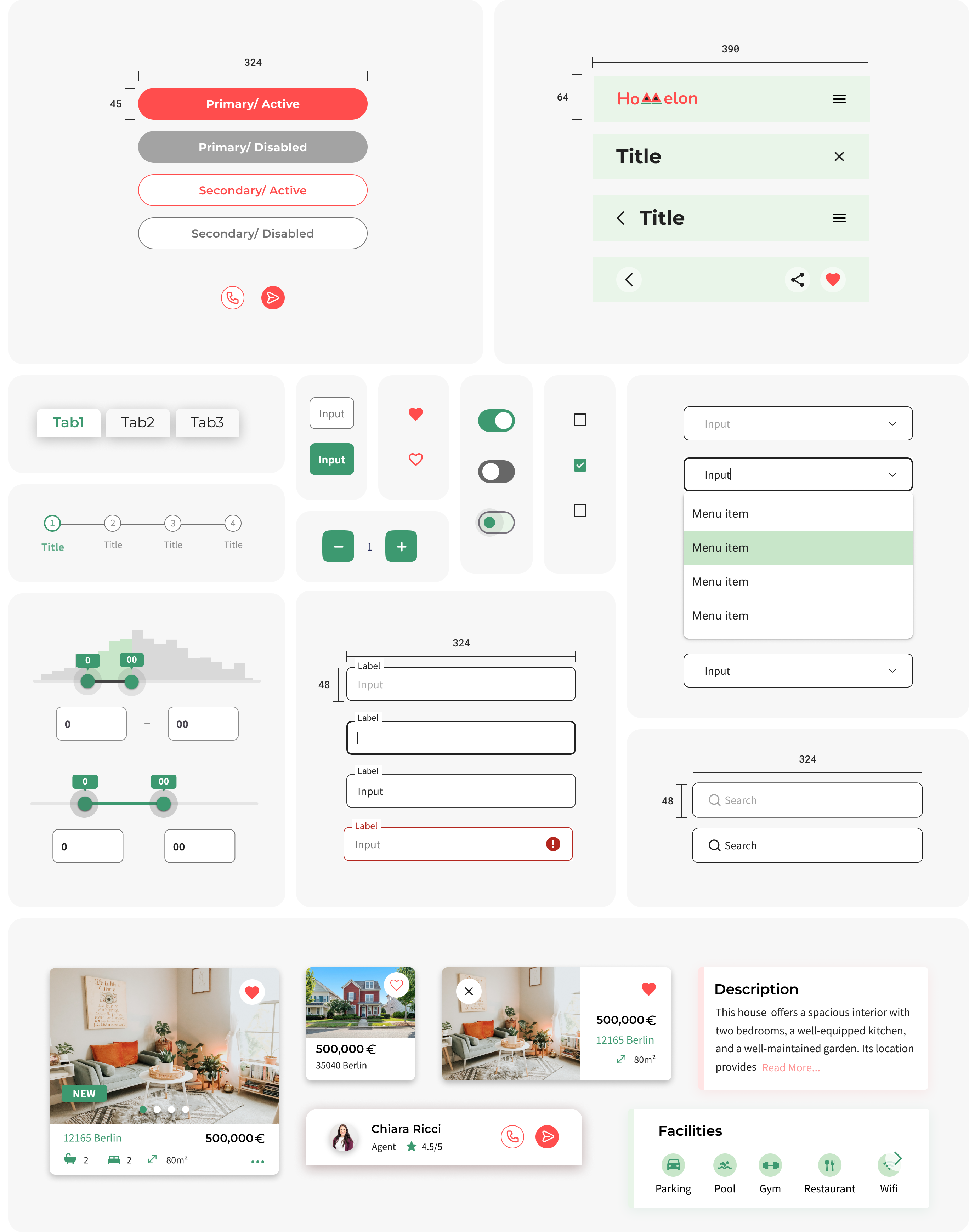
The logo style features rounded and filled shapes. The first logo is exclusively used within the app, whereas the second and third options are designed for the website and tablet.
2. Colors
The main colors, Sea Turtle Green and Coral Red, are inspired by the vibrancy of watermelon. By blending these colors, a harmonious balance between the calming, dependable Sea Turtle Green and the lively, passionate Coral Red is achieved. This equilibrium effectively conveys a sense of both stability and excitement, making it an ideal choice for a real estate app.
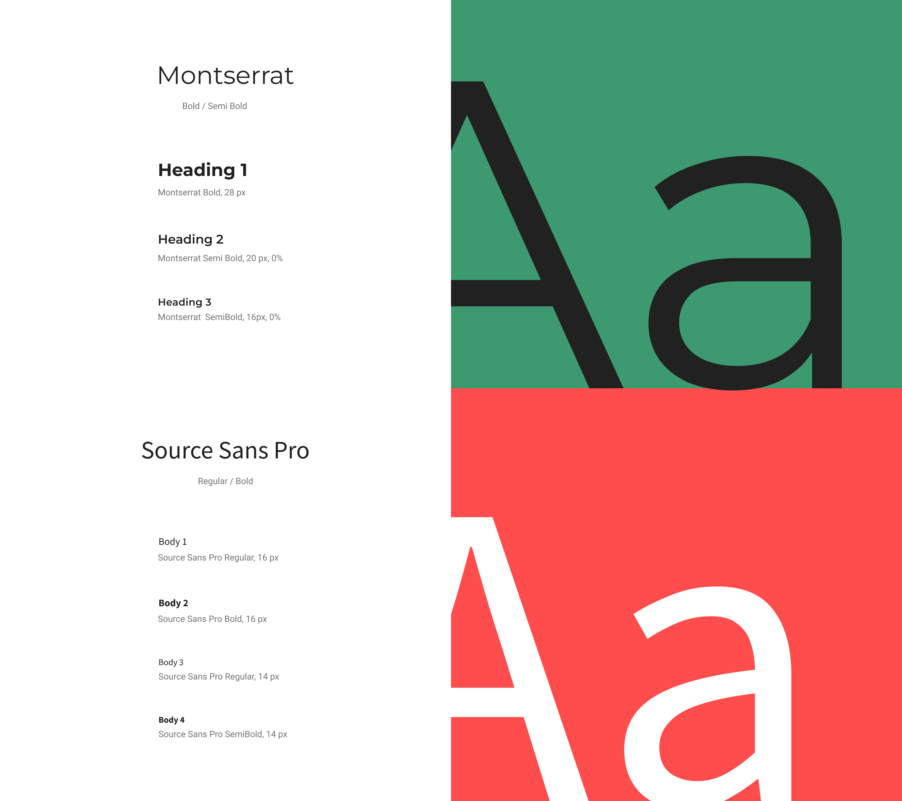
3. Typography
4. Iconography
The icon style features rounded corners to align perfectly with the overall style of the app. The location icon is inspired by the chosen color palette of the watermelon theme.
5. UI Elements
The UI elements have rounded corners to align perfectly with the overall style of the app.
6. Imagery
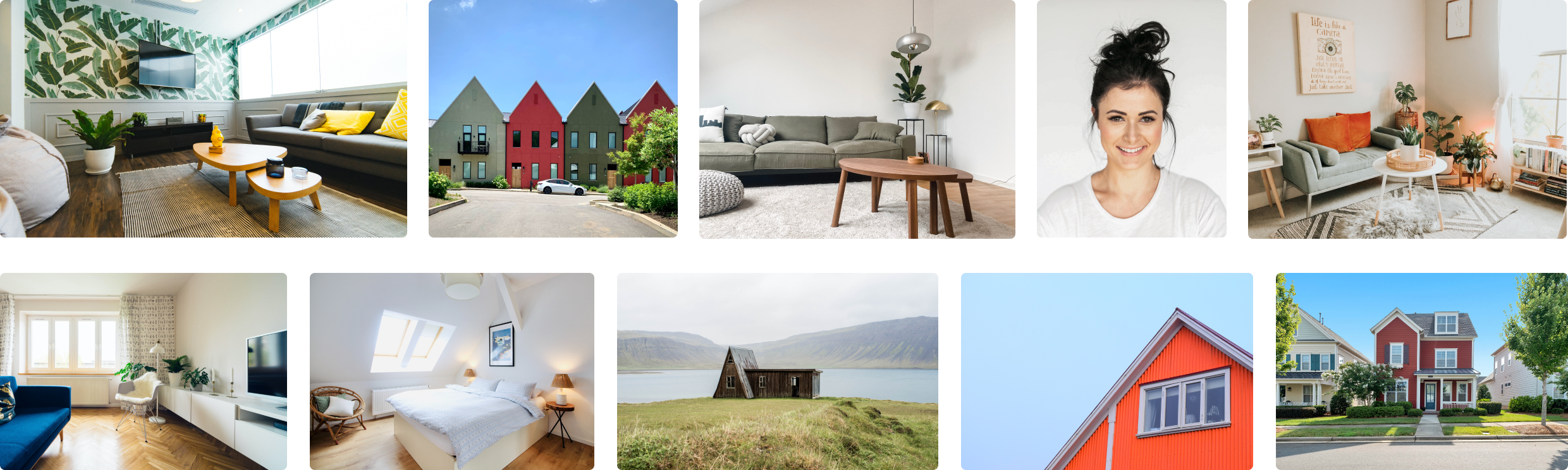
The pictures in the app adhere to a watermelon color palette, creating a sense of trust and comfort. The concept is to avoid overly professional studio shots to keep things realistic and transparent. The majority of these images are captured in natural daylight, ensuring design consistency and transparency. Many of the pictures incorporate natural elements such as landscapes and plants to harmonize with the chosen color palette.
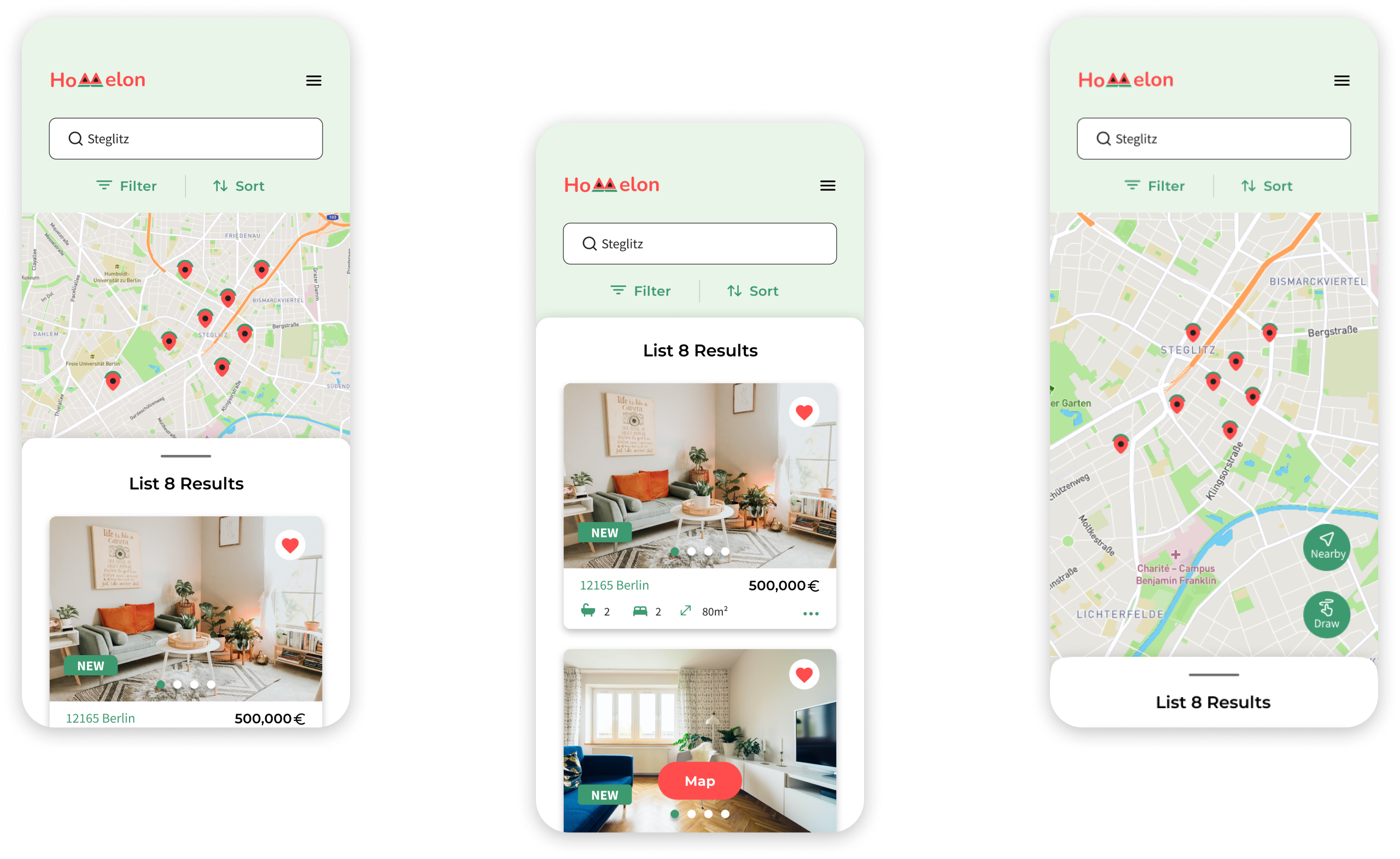
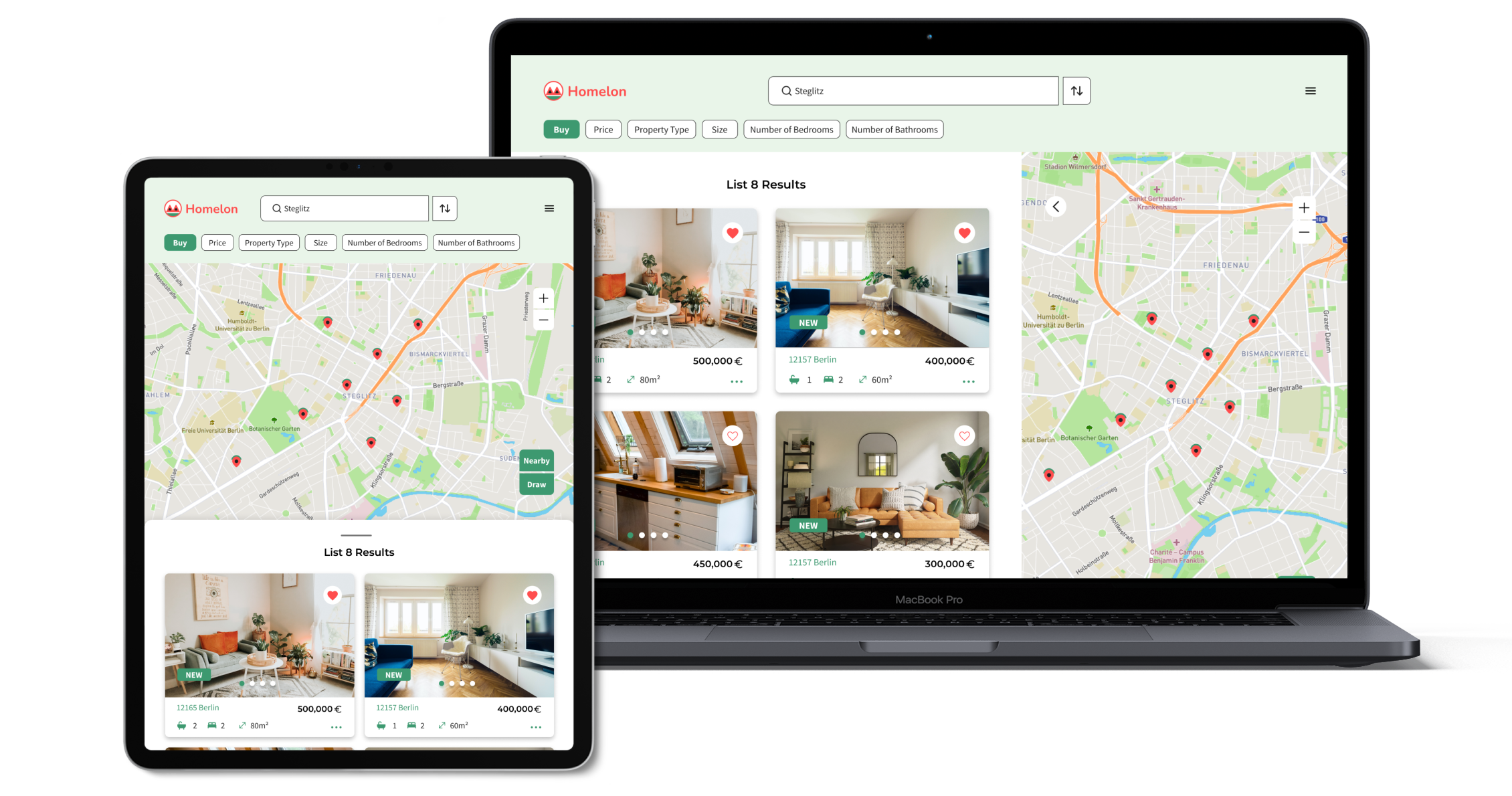
Search
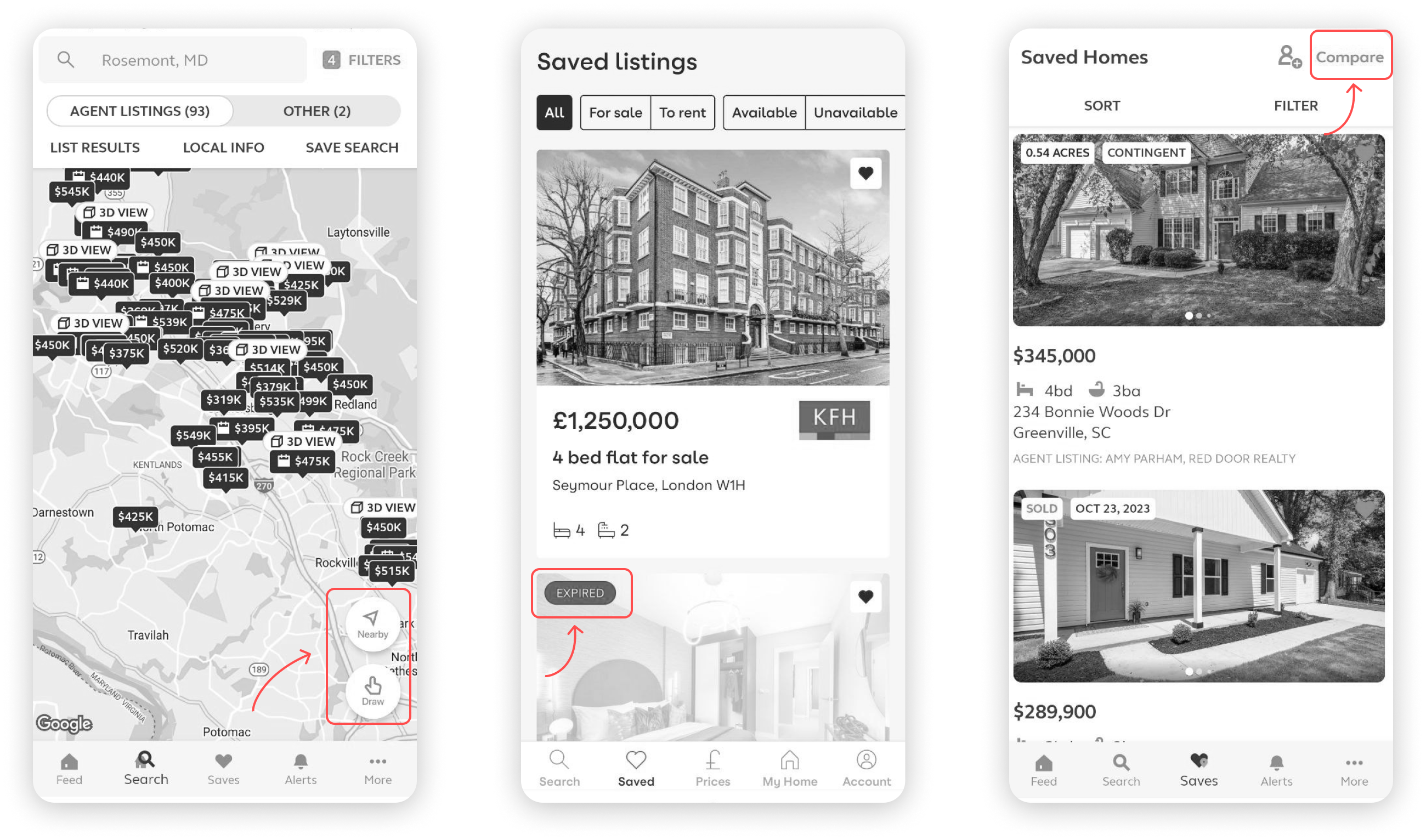
On the initial screen, users can view both listings and a map. Subsequently, they have the option to search either by scrolling through listings using a swipe-up gesture or by choosing to search on the map by tapping the map button.
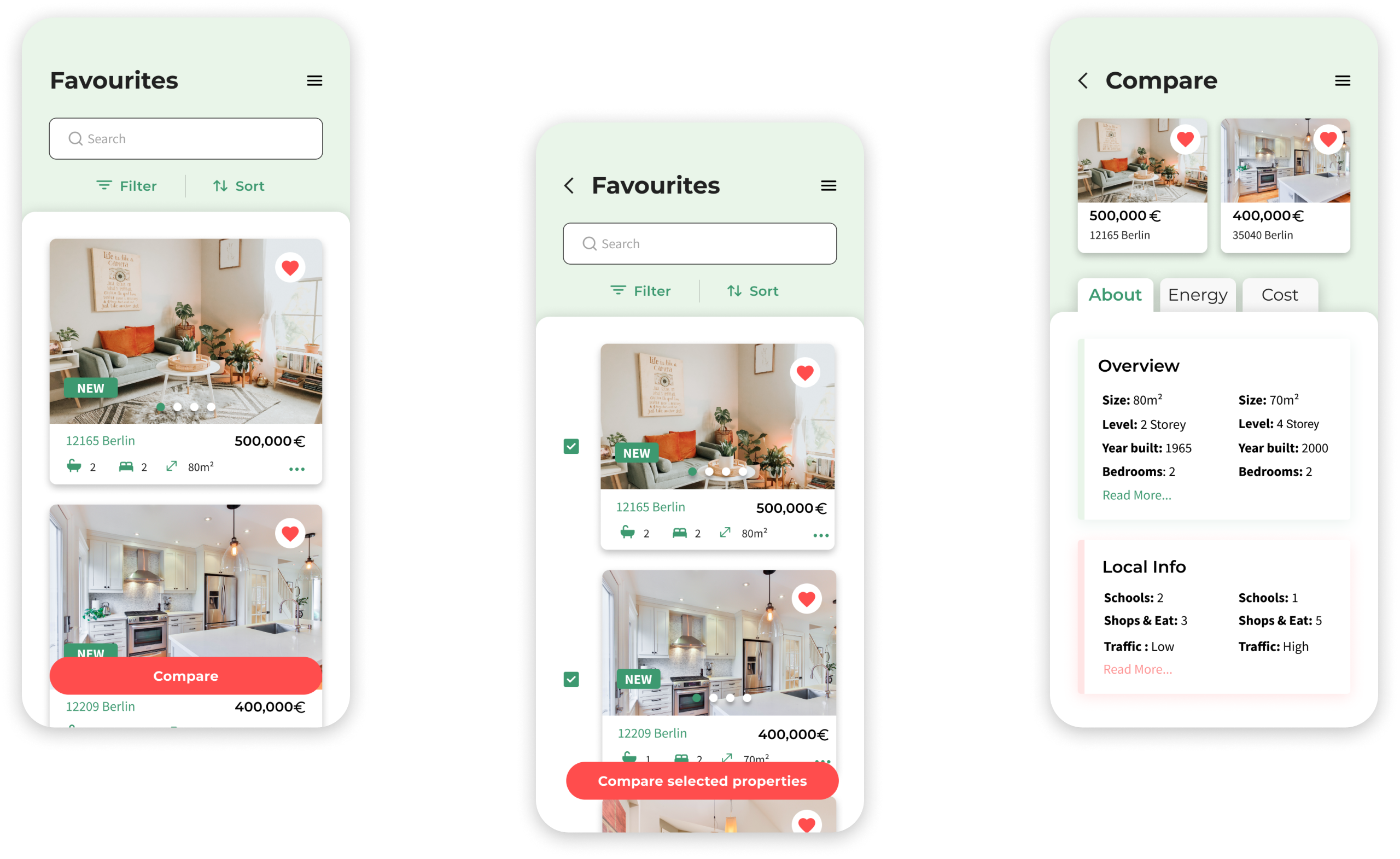
Favourite & Compare
On the favorite listing screen, users can not only view their saved properties but also compare them. By selecting two desired properties, users can view the comparison on the next screen. The primary objective is to simplify decision-making for the user. By comparing two favorite properties, users can assess factors such as size, price, facilities, energy usage, and more.
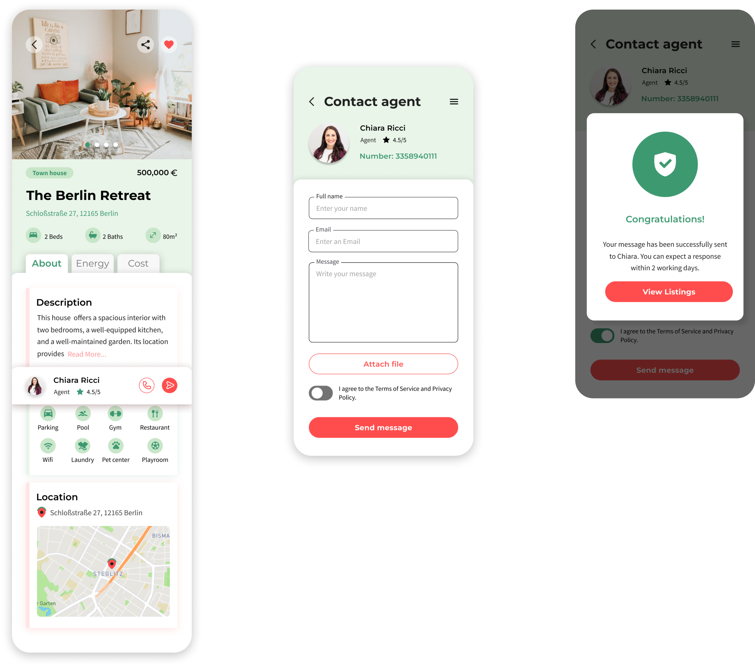
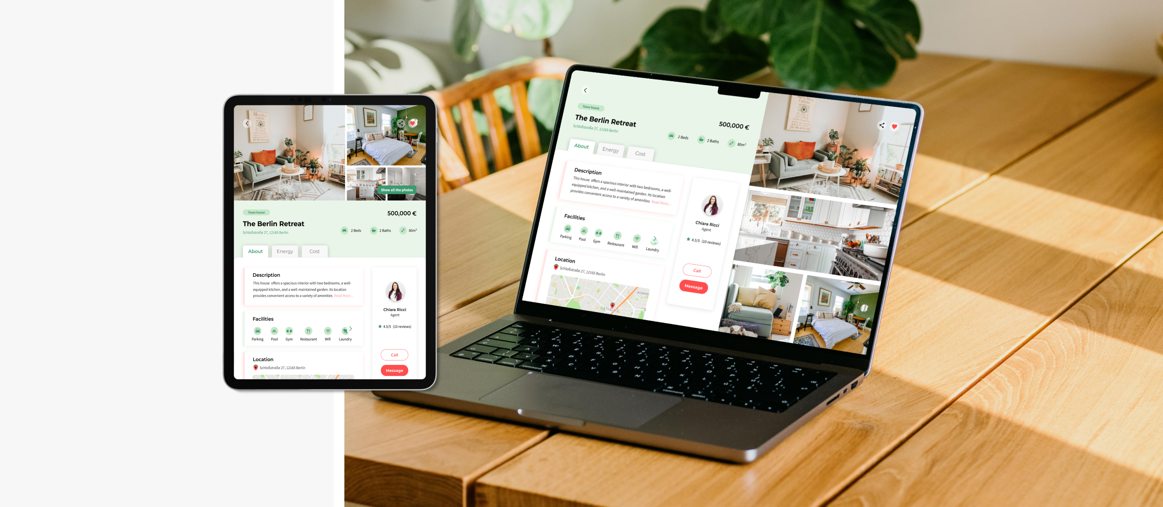
Property Info & Contacts
The property details screen provides all essential information, both visually and in writing, that users need to make an informed decision and take action by contacting an agent.
Retrospective
More projects