Overview
My journey at Chingu began as the sole designer in a 6-week voyage program, collaborating with a team of 4 developers and 1 voyage guide. Our task was to design a platform that encapsulated the extensive National History Museum data about dinosaurs in an engaging and educational digital experience. Throughout the process, I led the design efforts, ensuring intuitive user interfaces and engaging visual elements. Despite facing tight deadlines and ambitious goals, the project was both challenging and fun.
Project Goals

Requirements Prioritization
Faced with a tight deadline, our team quickly began gathering requirements for a user-friendly dinosaur information website. We needed to understand user needs and prioritize features to ensure we delivered the most impactful functionality within a limited timeframe
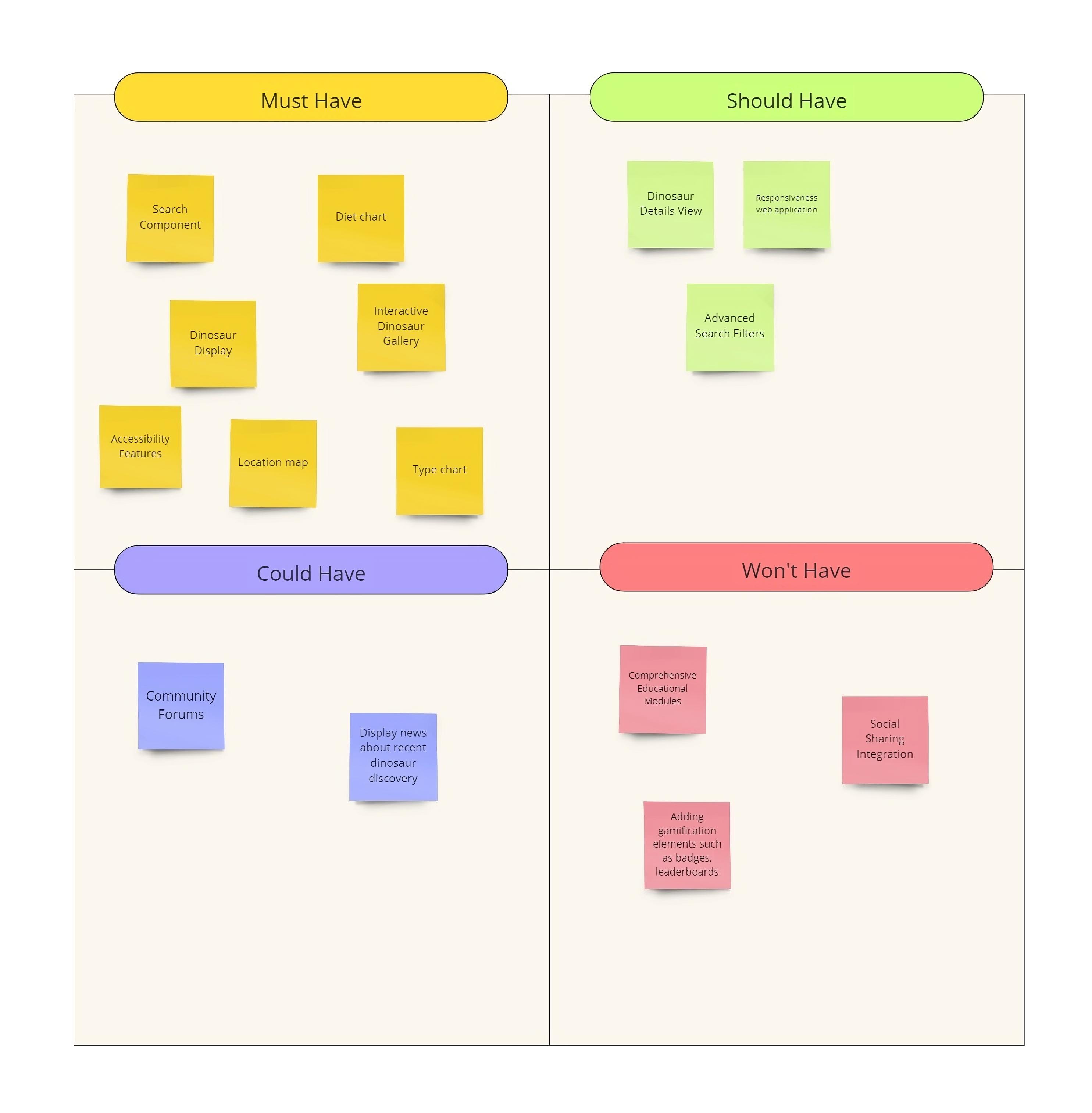
Client's Needs (MVP):
- Dinosaur Display
- Search Component
- Display two charts illustrating the distribution of general dinosaur diet and type data.
- Dinosaur Location Map
- Dinosaur Details View
- Responsive web application
Extras:
- Display news about recent dinosaur discovery
Project Plan
Sprint 1
- Introduce team members and schedule kickoff meeting-
- Conduct kickoff meeting.
- Select a project and create a Vision Statement.
- Define MVP priority features.
Sprint 2
- Set up the product backlog.
- Create a low-fidelity wireframe.
- Establish the team's GitHub workflow.
Sprints 3-5
- Design.
- Develop.
- Test.
- Deploy to production.
Sprint 6
- Close the project.
- Fix last minute bugs.
- Celebrate team success.
User Research
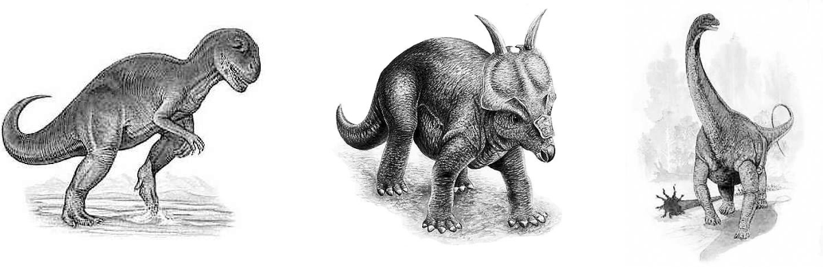
I began by reviewing the competitors' websites (like National Geographic Kids and Dinosaur Database) , to understand their structure and design elements . Many targeted children, using bright colors and animated dinosaurs illustrations. However, the illustrations we were provided in our dataset, had a more serious tone, with detailed representations and using only black and white. Therefore, I chose to tailor my app to both adults and kids who are passionate about dinosaurs by combining the more “serious” illustrations with bright pastel colors.
Low-Fidelity & User Stories


Data Visualisation
To rapidly explore and prototype methods for handling our extensive dataset, I used Google Looker Studio. This enabled me to promptly showcase to my teammates the main functionalities that our website should include, kickstarting our efforts to craft an interactive dinosaur exploration dashboard.
Usability Testing
I conducted two rounds of usability testing with five potential users to gather their feedback. After each round of interview, I refined my design based on user feedbacks.The main insights highlighted were ...


Technical Problems
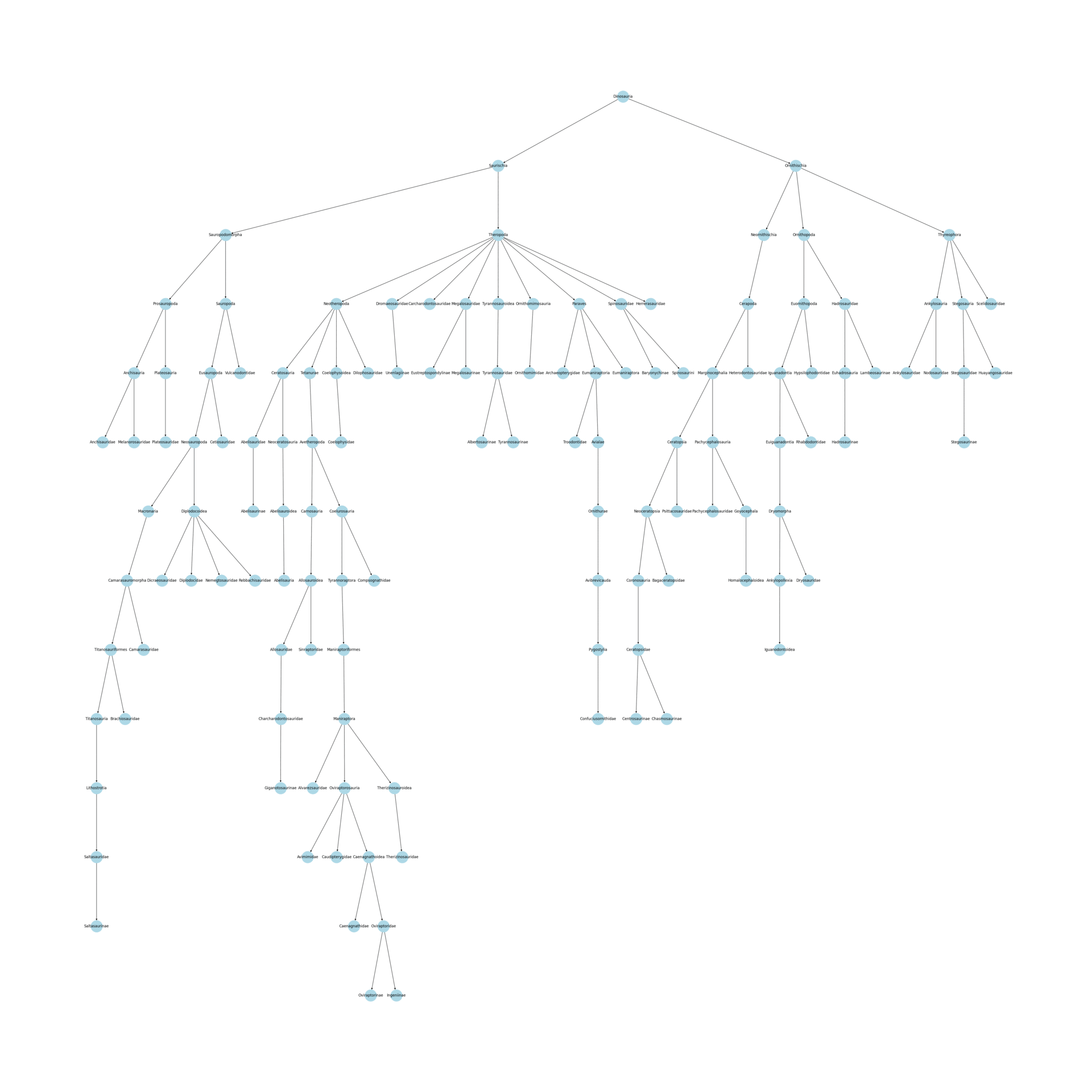
1. Taxonomy visualisation
The taxonomy dataset was more complex than expected: in its visual representation, the taxonomy resulted in a very deep evolutionary tree. Displaying the entire dataset would have been confusing and overwhelming for the user. For this reason, I decided to simplify the tree visualization by highlighting only its relevant branches based on the dinosaur selected.
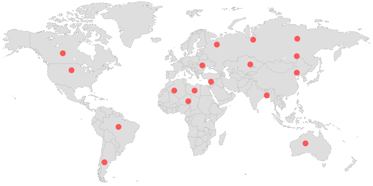
2. Map visualisation
The dataset only contained country-level geographic information. Having a single geo-location for multiple dinosaurs made it impossible to visualise the individual dinosaurs directly on the map (as dinosaurs from a same country would all overlap). For this reason, I decided that the best way to leverage country-level information would be to use a choropleth map, which would highlight the density of dinosaurs per country. Additionally, I placed a scrolling carousel containing a list of dinosaurs, to offer a simple way for users to select the dinosaur they are interested in.
High-fidelity
After two rounds of usability testing and iterative refinement of the main issues, I created the high-fidelity design.

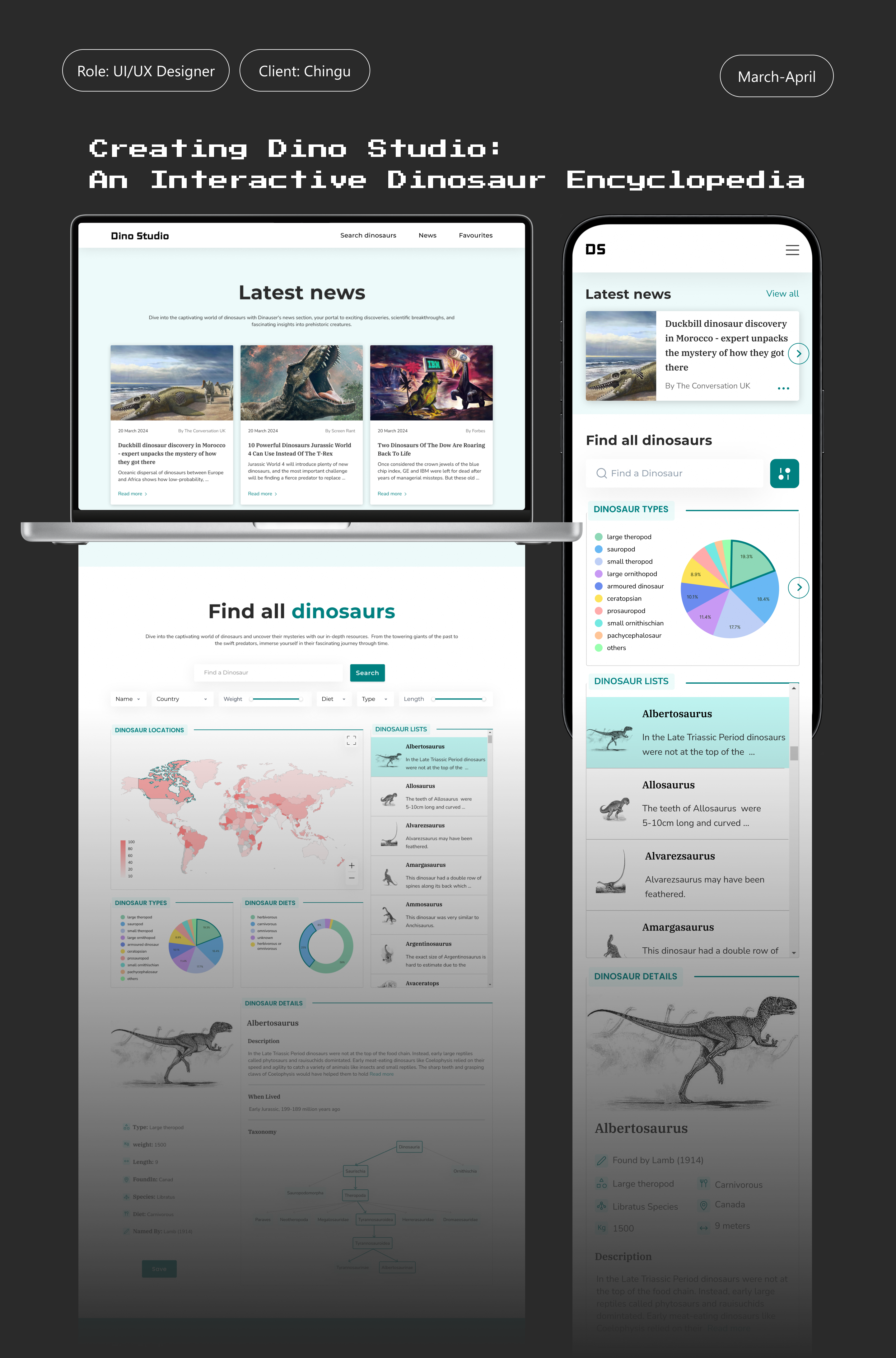
Result
The Dino Studio is a dynamic and engaging one-page website designed to serve as an all-in-one learning tool for people of all ages, offering an immersive journey into the world of dinosaurs. This web app features various interactive modules that cover different aspects of dinosaur knowledge, from their history and evolution to their habitats and taxonomy. The one-page design ensures seamless navigation, allowing users to easily scroll through sections and access information without feeling overwhelmed.
Retrospective
More projects